Introduction
Knowledge-based visual analytics (KBVA) is an approach that allows people to conduct visual analytics and design in a way that result in a knowledge base, which can be used to make informative decisions. KBVA supports the decision maker by using knowledge-based systems artificial intelligence tools and visual analytics facilities to work in a narrow domain to provide intelligent decisions with justification.
A Knowledge-based system (KBS) is an interactive computer-based decision tool that uses both facts and heuristics to solve difficult decision problems based on knowledge acquired from a Knowledge-based (Walker, 1990). However, a Knowledge-based system can also be defined as a problem-solving computer system that incorporates enough knowledge in some specialized problem domain to reach a level of performance comparable to that of a human Knowledge-based. The traditional data base environment deals with data that have a static relationship between the elements in the problem domain (Zheng, 2007). A knowledge base is created by knowledge engineers, who translate the knowledge of real human Knowledge-based into rules and strategies. The rules strategies can change depending on the prevailing problem scenario. The knowledge base provides the Knowledge-based system with the capability to recommend directions for user inquiry. The system also instigates further investigation into areas that may be important to a certain line of reasoning but not apparent to the user.
This paper is based on the work of Hao et al., (2007), the paper worked on “Intelligent Visual
Analytic Query” and noted in the future direction that current visualization tools do not support the automatic selection of charts or other visual display, our intention is to develop an adaptive Knowledge-based visual analytic techniques and tools that will focus on automatic selection of the best suited visualization (chart) for a given query or selection. We shall also incorporate interactive analysis of interested points from the visual representation in relation to other points in the output display. Our overreaching driving vision is to turn the information overload into an opportunity; just as information visualization has changed our view on databases;we proposed an adaptive Knowledge-based Visual Analytics Query as an enhancement of Intelligent Visual Analytics Query (IVQuery) which supports analysts in discovering the properties and relationships of selected patterns. IVQuery follows the Visual Analytics paradigm proposed by Thomas and Cook (2005) and aims at integrating analytical and visual methods. The general idea of IVQuery is to let the analyst select an area of interest in generated visualizations, identify the attributes and data records that correspond to the selection, and then apply automated analysis methods to identify characteristics of the selected data, as well as their relationships to other attributes and data items. IVQuery has been successfully applied in a number of different application scenarios, including data warehouse performance analysis, product sales, and server performance analysis, which demonstrate the benefits of this approach over traditional filtering and zooming techniques.
Having the right information at the right moment in time is crucial for making the right decisions. Decisions based on accurate and reliable information may lead to great success, while decisions based on incomplete or incorrect information may have serious consequences. In stock trading for example, having the right information in a jiffy improves the chances for a high profit, whereas having erroneous information may bring losses. One of the problems decision makers face today is the rapidly increasing amount of information that needed to be managed for decision making. Information technology have come to affect aspects of our modern society positively, a major by-product is the growing amount of information that is captured in a computer-readable form. The
automation of activities in all areas, including business, engineering, science, and government produces an ever-increasing stream of data stored in a database. We are overwhelmed by the quantum of information; though making decision has been very difficult. Millions of people make decisions without being able to analyze all the relevant information, which leads to decisions that are often wrong or at least suboptimal. Finding the right piece of information in a very large database remains a difficult and time-consuming activity. Our intention is to find effective ways for exploring the databases to give optimal information within the specified or acceptable time limit. This will be achieved through the effective use of available power of the computer hardware and the overture of our new innovative tool.
In dealing with very large amounts of data, users need to be adequately supported by analyzing and exploring large amounts of data through visualization. Visual representations of the data are especially useful for supporting a quick analysis of large amounts of multi-modal information like those available in the stock industries, providing the possibility of focusing on minor effects while ignoring known regular features of the data. Visualization of data which have some inherent two- or three-dimensional semantics has been done even before computers were used to create visualizations. Tufte (1990) provided many examples of visualization techniques that have been used for many years. Many novel visualization techniques were also developed by researchers working in the graphics field. In this paper, we proposed a new visualization technique in combination with analytical methods which support a highly structured visualization of large data sets using stock industries as a case study. The key goal of financial journalism is to answer the question, “How is the market doing today?” What makes this question tough is that there are so many possible answers: on a given day, the market as a whole may be up, but technology stocks could be down while Apple Computer’s stock might be up. Summing up the market with one or two index values hides a lot of the action. But if all the details are given, as in the stock price pages of a newspaper, the result is hard to read and there is no way to spot overall trends. Visual Analytics techniques have proven to be very effective in exploring patterns in large multi-dimensional data sets, and a number of well-known visualization methods have been proposed (Keim, 2002). Our visual analytic approach will lead to immediate insight in complex phenomena, interesting patterns, local phenomena representing local patterns (Card and Rao 1995; Furnas, 1986) and detection of outliers (Vliegen et al., 2006).
Related Research Work
Much work has been done on the studies and documentation of simple and effective analysis techniques for KBVAQS; for example, The Thinker’s Toolkit by Jones (1995), Conceptual Blockbusting by Adams (2001) and Psychology of Intelligence Analysis by Heuer (1999), all describedrepresentative approaches. They observed that the professional analysts are often armed with a broad repertoire of techniques, but these are not available to the research community as a whole. They believe analysts must deal with data that are dynamic, incomplete, often deceptive, and evolving. This problem of coping with such diverse and changing information has also been recognized for centuries. For example, a problem-solving method is data analyzed, broken into their elements, and study to reveal evidence, and solutions as synthesized by accumulating the evidences. Structured argumentation, which is the linking of evidence and assumptions through formal logic, has a large literature to draw on (Schum, 1994). Some capabilities for structured argumentation are in limited practice, and a good basic body of research has been conducted through Kirschner et al., (2003), he summarizes current views of the relationship between visualization and argumentation. He speculated that structured argumentation could be the basis of visual analytics systems. We believe more work is needed to explore this possibility.
Visualization of large amounts of arbitrary multidimensional data is fairly a new research area. Early approaches include scatter plot matrices (Andrew, 1972). Chernoff faces (Inselberg and Dimsdale, 1981) and parallel coordinates (Brissom, 1979). Researchers in the graphics/visualization area are currently extending these techniques to the usefulness of large data sets, as well as developing new techniques and testing them in different application domains. The techniques can be classified into geometric projection techniques, iconic display techniques Beddow 1990, Sparr et al, 1993), hierarchical techniques (LeBlanc et al., 1990, Mihalisin et al., 1990, Shneiderman 1992), dynamic techniques (Asimor 1985, Atilberg 1994). Their research also resulted in various prototype systems for data exploration which implement some of the mentioned techniques. Examples include statistical data analysis packages such as Data Desk, Trellis (Becker and Cleveland, 1995), and database oriented systems such as the Information Visualization and Exploration Environment (IVEE) (Ahlberg and Wistrand, 1995).
Dynamic query systems such as the filmfinder and homefinder application using starfield displays has also been an improved development that allow user to rapidly explore large data sets through convenient interfaces to range and join queries (Ahlberg et al, 1992). Their technique is particularly appealing for some scientific application such as chimpanzee feeding behaviour, because it engages large volume of data available for exploration. Unfortunately, while starfield display can easily show two independent dimensions, they do not support display of periodic and serial attributes of the same data dimension. Also, focus + context interfaces provides user with a view on the details of a small part of a data set while using area , perspective, or volume to show the surrounding context in reduced details. A variety of these techniques have been shown to be suitable for different data types. Examples includes hyperbolic browser for trees (Lamping and Rao, 1994), a document lens for documents organized in pages (Robertson and Mackinlay, 1993), a variety of special lens for viewing maps and graphs (Sarkar,1991). Of these the most promising is the document lens, since pages have periodic components. But despites the features, it was not found particularly useful for exploring periodic patterns and relationships between the dataset.
In recent years, the interactive analysis and exploration of large data sets has attracted a lot of research attention. The Polaris system (Tufte, 1997), for example, allows users to interactively generate visual representations from relational data. The user select single dimensions or measures from the
underlying relational data via drag and drop; visual representations of the data, such as line and bar charts, are constructed for these selections. The user may then refine the search, e.g., by interactively adapting the visual representations via rubber-banding or interactive queries.
The VisDB System (Tufte, 1997) is another well-known system that supports the exploration and analysis of large databases using pixel-based visualization techniques. The graphical user interface of the VisDB System allows a direct interaction with the data. Users, for example, interactively change the query ranges, highlight corresponding pixels in different sub windows, use a projection of the visual representation to the specific colour ranges, and access the attribute values that correspond to some specific pixel. Although these techniques have been proven to be very powerful tools to reveal patterns from large data sets, they often do not provide the user enough functionality to explore the causes or impacts of those patterns. For example, if the user identifies an obvious pattern in a single dimension of a data set, it would be important to analyze the relationship to other dimensions, e.g., by identifying and visually representing the correlations to other dimensions.
In “Illuminating the Path” Thomas et al, (2005) defines visual analytics as the science of analytical reasoning facilitated by interactive visual interfaces. However, we want to add that, visual analytics should combine automated analysis techniques with interactive visualizations for an effective understanding, reasoning and decision making on the basis of very large and complex data sets. The goal of visual analytics should be the creation of tools and techniques to enable people to; synthesize information and derive insight from massive, dynamic, ambiguous, and often conflicting data; detect the expected and discover the unexpected; provide timely, defensible, and understandable assessments and communicate assessment effectively for action. According to (John and Turkey, 1977), effective tools as well as perception are needed for the interactive and undirected search for structures and trends.
An efficient management of data of various types and qualities is a key component of Visual
Analytics as this technology typically provides the input of the data which are to be analyzed. Generally, a necessary precondition to perform any kind of data analysis is an integrated and consistent data loom (Han et al, 2000 and Hand et al, 2001). Database research has until the last decade focused mainly on aspects of efficiency and scalability of exact queries on homogeneous, structured data. With the advent of the Internet and the easy access it provides to all kinds of heterogeneous data sources, the database research focus has shifted toward integration of heterogeneous data. Finding integrated representation of different data types such as numeric data, graphs, text, audio and video signals, semi-structured data, and semantic representations and so on is a key problem of modern database technology. But the availability of heterogeneous data not only requires the mapping of database schemata but includes also the cleaning and harmonization of uncertainty and missing data in the volumes of heterogeneous data. Modern applications require such intelligent data fusion to be feasible in near real-time and as automatically as possible (Naumann et al, 2006).
A huge number of algorithms such as Decision Trees, Support Vector Machines, and Neuronal Networks have been developed. A prominent analysis task is that of cluster analysis (Han et al, 2000, Hand et al, 2001), which aims to extract structure from data without prior knowledge being available. Solutions in this class are employed to automatically group data instances into classes based on mutual similarity, and to identify outliers in noisy data during data preprocessing for subsequent analysis steps. Further data analysis tasks include tasks such as association rule mining (analysis of co-occurrence of data items) and dimensionality reduction. While data analysis initially was developed for structured data, recent research aims at analyzing also semi-structured and complex data types such as web documents or multimedia data (Perner, 2002). It has recently been recognized that visualization and interaction are highly beneficial in arriving at optimal analysis results (Ceglar et al, 2003). In almost all data analysis algorithms a variety of parameters needs to be specified, a problem which is usually not trivial and often needs supervision by a human Knowledge-based. Visualization is also a suitable means for appropriately communicating the results of the automatic analysis, which often is given in abstract representation, e.g., a decision tree. Visual Data Mining methods proposed by Keim et al., (2003) try to achieve exactly this.
Effective utilization of the powerful human perception system for visual analysis tasks requires the careful design of appropriate human-computer interfaces. Psychology, Sociology, Neurosciences and Engineering each contribute valuable results to the implementation of effective visual information systems. The development of principles, methods and tools for design of perception-driven, multimodal interaction techniques for visualization and exploration of large information spaces, as well as usability evaluation of such systems (Jacko, 2003, Dix et al, 2003). For example, with widespread availability of low cost Geographical Positioning System (GPS) devices, it is becoming possible to record data about the movement of people and objects at a larger scale. While these data hide important knowledge for the optimization of location and mobility oriented infrastructures and services, by themselves they lack the necessary semantic embedding which would make fully automatic algorithmic analysis possible. At the same time, making the semantic link is easy for humans who however cannot deal well with massive amounts of data. Andrienko (2007) argued that by using the right visual analytics tools for the analysis of massive collections of movement data, it is possible to effectively support human analysts in understanding movement behaviours and mobility patterns. He proposes a framework where interactive visual interfaces are synergistically combined with database operations and computational processing.
Methodology
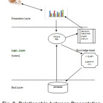
Our system design shows how the system will fulfil the objectives identified in the system analysis. It serves as the overall plan or model that consists of all the specifications about the system, its form and structure. It is also a function and features of a Knowledge-based visual analytics queries system. The structure and characteristics model also describe the basic building block of object-oriented systems, the relationships between them and the class diagram. The system model is shown in Figure 1.
The Knowledge-based is about the field of interest which symbolically described the system-specification. The inference engine is the general problem solving knowledge supporting the operation of the other components. The case-specific database holds and reveals information from outside and initial data of the concrete problem and from the information obtained during reasoning. The explanation subsystem ask the why, what if, what is, how, why not, what is question for explanation reasoning, intelligent help, tracing about the actual reasoning steps, hypothetical reasoning, conditional assignment and its consequences. The knowledge acquisition subsystem checks; the syntax of knowledge elements, the consistency of Knowledge-based (verification and validation), do knowledge extraction, build knowledge base, do automatic logging and book-keeping of the changes of knowledge base and tracing facilities like handling breakpoints, automatic monitoring and reporting the values of knowledge elements. The user interface is a dialogue on natural language for consultation and suggestion; it connects to database and other connections.
The table sector stores information about stocks while the company table keeps information about registered companies. The stock table stores information about a particular voyage. When a User sends a request to the system through the Presentation Layer, the Presentation Layer passes the request to the Logic Layer. The Logic Layer is responsible for the full functionality of the system. The Logic Layer filters their quest using Knowledge-based visual analytic query system (KBVAQS) programmed with C# and SQL (Structured Query Language) and then forwards it to the Back Layer.
The System in return, response to the user’s request to the system by pulling the appropriate data from the database located in the Back Layer with C# and SQL in the Logic Layer. The Logic Layer checks the data against the Decision Table for the most suitable chart representation and forwards the result to the Presentation Layer for the user to visualize and interpret.
The presentation layer is mainly for the administrator and ordinary users. They both interact directly with the system through the User Interface (UI) provided by the system. Data is displayed graphically for the user to interpret. The administrator has authorized access to the system with well defined roles. Some of the activities carried out based on the set roles include; Sector Creation, Company Creation, Stock Data Entry, Validation and Maintenance
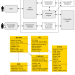 |
Figure 1: Structure and Characteristics Model linking the Class Diagram for the Proposed Visual Analytics Queries System
Click here to View figure
|
Ordinary user does not have full access to the system. They have limited roles. These roles include; Stock Data Entry and System Testing and Error Reporting. The logic layer is responsible for the full functionality of the implementation. This is where the logic behind the project is being carried out. This is achieved with one of the latest and robust object oriented programming language called C# pronounced as C-Sharp. With the help of this language, the System has rich features to meet up to expectation in satisfying the users’ unlimited wants and the organization goals.
The layers are responsible for data keeping, analysis and revelation. The database houses the data for future purpose so that any information about a particular sector, a company or group of companies in a particular sector. Stock details for a particular day, month or year can be easily retrieved. Summary of explanation is represented by a diagram in Figure 2.
KBVAQS Attributes Groupings
The goal of KBVAQS is to support a number of common analysis tasks. Based on the characteristics of the interactively selected data, we identified four common analytics scenarios, which correspond to general visual analytics tasks and are independent of the underlying visualization technique. According to the characteristics of the interactively selected data, KBVAQS automatically identifies the analysis task and selects one of our standard cases and the appropriate analysis functions.
Case 1: one attribute in one group
This is the most common case when analyzing relations in the data; it is the selection of one continuous interval across a single attribute within one group. There is no distinction between ordered and unordered data. In the data sets without grouping, KBVAQS searches for other attributes that are most closely related to the selected subset. In the case of grouping, the algorithm only searches for relevant attributes within the selected group. The results can be visualized by displaying all attributes that are relevant for the selection or by ordering the attributes within the group according to their relevance. It should be noted that an ordering of attributes according to their relevance with respect to a selected attribute, which is supported by a number of existing tools, is a special instance of this case.
Case 2: multiple attributes in one group
If multiple groups are involved, we have to distinguish between visualizations that have a designated data ordering attribute and visualizations without consistent data ordering. While visual maps order all items in each bar from left to right, typically according to a time stamp or some other attribute value, the items in the parallel coordinates plot are sorted differently on each axis, based on the value of the corresponding attribute. For ordered visualizations that have a grouping attribute, the default of our KBVAQS algorithm analyzes the other groups to identify groups that are relevant on the selected interval by considering only the selected attributes. The result can then be used for a reordering of the groups, to place groups close to each other that are similar in the selected area. It is also possible to analyze the selected group and identify other attributes that are relevant to the selected attributes. For unordered visualizations without grouping, other methods are necessary. The default option of KBVAQS is to perform a clustering to find relevant attributes. Other approaches are possible depending on the specific visualization.
Case 3: one attribute in multiple groups
This case is aimed at selecting one attribute in multiple groups. KBVAQS y handles it by applying case 1 independently for each selected group, which means that KBVAQS searches within each group for other attributes that are closely related to the selected subset. The results are individual sets of relevant attributes for each selected group.
Case 4: multiple attributes in multiple groups
The fourth case defines selections that span multiple attributes over multiple groups. In this case, for ordered data KBVAQS searches for other intervals that are related to the selected attributes and groups; and for unordered data, it performs a
KBVAQS Algorithms
For ease of understanding we present KBVAQS
algorithm procedure below:
PROCEDURE: KBVAQS
Input: Set of attribute dimension D,
interactive selection D’ C D, Ordering
attribute Do E D, Grouping attribute Dg E D
Output: D ordered by relevance
If Dg = Ø or | D’g | = 1 then //
one group selected
If |Attribs (D’)| = 1 then
//Case 1: (One Attribute in one group)
/* consider all attributes of the selected group */
Foreach attrib in Attribs (Groups (D’)) do
/* only observations in the selected group and
interval are considered
d = filter (attrib, Groups(D’), Interval(D’));
rel [attrib] = calculateRelevance(D’, d);
Call procedure knowledge-based system ( );
else
// Case 2: Multiple Attributes in one Group
Foreach group in groups (D’) do
d’ = filter(attrib, Groups(D’), Interval(D’));
d’ = filter(attrib, Groups, Interval(D’));
r = calculateRelevance(d’, d);
rel [group] = combine(rel / group /, r);
Call procedure knowledge-based system ( );
else /* multiple
groups selected */
if |Attribs (D’)| = 1 then
// Case 3: One Attribute in
multiple Groups
/* handle as case 1 for each
involved group
Foreach group in Group(D’) do
Call procedure knowledge-based system ( );
(see case 1);
Else if Do ‘“ Ø then /*
ordered and multiple attributes selected
// Case 4: Multiple Attributes in Multiple
Groups
/* search over ordering attributes
Foreach interval in Do with |Interval| = |D’|
do
Foreach group in Groups(D’) do
Foreach attrib in Attribs (D’) do
d’ = filter(attrib, Groups,
Interval(D’));
d = filter(attrib, Groups, Interval);
r = calculateRelevance(d’, d);
rel [interval] = combine(rel / interval
/, r)
end if
/*unordered and multiple attributes
selected*/
/*do not allow this case or provide a
visualization dependent approach *
Call procedure knowledge-based system ( );
Return D, ordered by descending rel;
PROCEDURE: Knowledge-based System ()
Input: Set of attribute dimension attr, interactive
selection G’ C G,
Output: Chart.
Function Select_Best_Chart (G’: Groups, attr: String
[]): Chart
Chart c=null;
if COUNT (G’) =1 then
if COUNT(attr) =1 then
c=Chart.BarChart;
else if COUNT(attr) =2 then
c=Chart.PieChart;
else COUNT(attr) >2 then
c=Chart.Histogram;
end if
else if COUNT (G’)=2 then
if COUNT(attr) =1 then
c=Chart.BarChart;
else if COUNT(attr) =2 then
c=Chart.PieChart;
else COUNT(attr) >2 then
c=Chart.Histogram;
end if
else
if COUNT(attr) =1 then
c=Chart.BarChart;
else if COUNT(attr) =2 then
c=Chart.PieChart;
else COUNT(attr) >2 then
c=Chart.Histogram;
end if
end if
return c;
END Function
Function Select_Best_Chart_Type (attr: Attribute):
Chart
Chart c=null;
Integer length=0;
If Does_Attribute_Has_Any_Child (attr) = true
then
If GetChildrenOf(attr)>0 Then
length=GetChildrenOf(attr);
if GetDepth(attr) =0 then
if length=1 Then
c=Chart.BarChart;
else if length=2 Then
c=Chart.Histogram;
else
c=Chart.LineChart;
end if
else
if length=1 Then
c=Chart.AreaChart;
else if length=2 Then
c = Chart.LineChart;
else
c = Chart.LineChart;
end if
end if
end if
end if
return c;
End Function
Function Count (ArrayList: Collection): integer
integer counter=0;
Foreach Object in ArrayList do
counter=counter+1;
return counter;
END Function
Function Does_Attribute_Has_Any_Child
(a:Attribute): Boolean
If Child(a).Count>0 then
Return true;
Else
Return false;
END Function
Function GetChildrenOf(attr:Attribute) : integer
If Does_Attribute_Has_Any_Child (attr)=true then
Return Child(attr).Count;
Else
Return 0;
End Function
Function GetDepth( attr: Attribute) : integer
If attr.depth>=1 Then
Return true;
Else
Return false;
END Function
Results
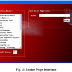
The data entry part consists of the sector page interface (Figure 3) where list of existing sectors can be found for selection and the registration of new sectors can be performed.
The company page interface contains the list of existing companies; new company can also be added at this stage. The list of the sectors from the sector page interface is also exposed through a combo box selection for ease of reference for users. The stock page accommodates the data entry for stock date and the daily stock entries. The summary of data entry information through an automated message box for review is thereafter revealed, corrected and validated by the user. User click “yes” if the data entry is considered okay and “no” for review and corrections. Data Success Alerts is thereafter automatically activated for success.
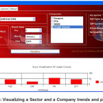
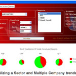
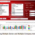
Sample visualization of stock market trend:
The visualization of data for the market trend was manipulated through the powerful algorithms to reveal trends and patterns. The data were converted to graphics for ease of manipulation, interaction and understanding of the users. Hidden trends are revealed which open the mind of the user for better usage of its intuition for judgement in other to arrive at a meaningful conclusion. In other to better understand the visualization process, sample data were entered into the visualization interface for various conditions as revealed in Figures 4, 5 and 6
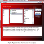
Despite the ability of the tool to visualize trends and patterns. The tool also has the potential to reveal the results of the analysis using statistical correlation and regression analysis. For example, the stock visualization of unaab consult, Dunlop, dangote and carina were considered for analysis. The correlation between the company’s stocks with the regression results are revealed in the text region of the analysis interface in figure 7.
Usability test
The effectiveness of KBVAQS tool was evaluated in surveys carried out at the Nigerian Stock Exchange which deals with stock markets. The result (using student’s t-test) shows that users generally viewed KBVAQS tools more positively than using existing Intelligent Visual Query Algorithm (IVQA) technique. These differences were significant to p<0.05. The mean interactions precision and calculated value using expert judge relevance rating show a significant difference between KBVAQS tool and IVQA performance 2.47 against 1.73 for precision with calculated t= 6.33. The hypothesis testing revealed that KBVAQS user performed better and achieved acceptable results.
The user satisfaction regarding the software is high. The users agreed that the tool supports their tasks in an efficient way. They agreed that the charts produced are clear, precise and understandable. The tool also provides relevant help whenever it is needed. Users are satisfied that they are in control as they are able to manipulate the tool to behave in the way they want it to. It was generally agreed that the interface is easy and save to navigate.
Conclusion
The aspiration of KBVAQS is to make our way of processing data and information transparentfor an analytic discourse through the use of filtering and zooming technique. This we provide by means of communicating with the data instead of being left with the results (final output). We also foster the constructive evaluation, correction and rapid improvement of these processes and models and ultimately improve user’s knowledge and decisions. On a grand scale, we provide technological solution that combines the strengths of human and electronic data processing. Our Visualization technique becomes the medium of a semi-automated analytical process, where users and machines cooperate using their respective distinct capabilities for the most effective results.
A Knowledge-based visual analytics tool that enhanced the effectiveness of the analysis and visualization of data was implemented. Users select various attributes and groups, among various features. Any group of interest to the Users would make the tools automatically generate the best visual representation of the User’s choice. Furthermore, our technique allows users to form a strong opinion about the cognitive aspect of the visual representation. Our usability test questionnaire allows quantification of the end users’ experience with the software, encourages the tester to focus on issues that the end users have difficulties with. The experimentation with the users showed that the tools is very powerful in visualizing and analyzing data, it adequately provides more effective usage of visualization compared to previous visualization techniques.
References
- Ahlberg C., Shneiderman B. : “Visual Information Seeking: Tight Coupling of Dynamic Query Filters with Starfield Displays”, Proc ACM CHI Int. Conf. onHuman Factors in Computing (CHI94 ), Boston, MA, pp. 313-317 (1994).
- Adams, J. L. : “Conceptual Blockbusting: A Guide to Better Ideas” Perseus PublishingCambridge, Massachusetts. Fourth edition, Pg. 4-5 (2001).
- Ahlberg C., and Wistrand E. : “IVEE: an Information Visualization and Exploration Environment”, Proc. Int. Symposium on Information Visualization, Atlanta, GA, pg 14 (1995).
- Ahlberg, C., Williamson, C., and Shniederman, B. : “Dynamics queries for information exploration: an implementation an evaluation”. Proceedings of CHI, pg 3-5 (1992).
- Andrews, D. F. : “Plots of High-Dimensional Data”, Biometrics, 29, pp. 125-136 (1972).
- Andrienko, G., Andrienko, N., Wrobel, S. : “Visual analytics tools for analysis of movement data.”, ACM SIGKDD Explorations 9(2): (2007).
- Asimov, D. : “The Grand Tour: A Tool For Viewing Multidimensional Data”, SIAM Journal of Science & Stat. Comp., 6, 128-143 (1985).
- Becker R., Cleveland B. : “Trellis displays”, Proc. Workshop on Design and Implementation of Data Analysis Systems, Heidelberg, Germany, pg 26-27 (1995).
- Beddow, J. : “Shape Coding of Multidimensional Data on a Mircocomputer Display”, Visualization ‘90, San Francisco,CA, pp. 238-246 (1990).
- Brissom, D. : “Hypergraphics: Visualizing Complex Relationships in Art, Science and Technology”, Amer. Association for theAdvance of Science, Westview Press, Boulder, pg 22-24 (1979).
- Card, S., and Rao, R: “Exploring Large Tables with the Table Lens”. Proceedings of the ACM Conference on Human Factors in Computing Systems, pg 23-27 (1995).
- Ceglar, A., Roddick, J.F., Calder, P. : “Guiding knowledge discovery through interactive data mining”, IGI Publishing, Hershey. pp. 45–87 (2003).
- Dix, A., Finlay, J.E., Abowd, G.D., Beale, R. : “Human-Computer Interaction”, 3rd edn. Prentice-Hall, Inc., Upper Saddle River (2003).
- Furnas : Generalized Fisheye Views. Proceedings of the ACM Conference on Human Factors in Computing Systems (1986).
- Han, J., Kamber, M. (eds.): : “Data Mining: Concepts and Techniques.”, Morgan Kaufmann, San Francisco. Pg 2-3 (2000).
- Hand, D., Mannila, H., Smyth, P. (eds.): “Principles of Data Mining.”, MIT Press, Cambridge (2001).
- Hao M., Dayal U., Keim D., Schreck T.: “A Visual Analysis of Multi-Attribute Data Using Pixel Matrix Displays”. In Proc. VDA07 (2007).
- Heuer, R. (1999): Psychology of Intelligence Analysis. U.S. Government Printing Office, Washington, D.C. pg 1-2.
- Inselberg, A., Dimsdale, B. : Parallel Coordinates: “A Tool for Visualizing Multivariate Relations” (chapter 9). Plenum Publishing Corporation, New York. pp. 199– 233 (1991).
- Jacko, J.A., Sears, A. : “The Handbook for Human-Computer Interaction.”, Lawrence Erlbaum & Associates, Mahwah (2003).
- Jones M. : The Thinker’s Toolkit: 14 Powerful Techniques for Problem Solving. Three RiversPress, New York.pg 34-37 (1995).
- Keim, D. A. : Information visualization and visual data mining. IEEE Transactions onVisualization and Computer Graphics, USA* vol 8 (Jan. March 2002), no 1, p 1 8, 67 (2003).
- Keim. D. A. : “Information Visualization and Visual Data Mining”, IEEE Transactions on Visualization and Computer Graphics (TVCG) 1, (8) pages 1-8 (2002).
- Kirschner P. A., Shum, S.J.B and Carr. C.S. : Visualizing Argumentation: Software Tools for Collaborative and Educational Sense-Making. Springer-Verlag, London. pg 2-3(2003).
- Lamping, J. and Rao, R.: “Laying out and visualizing large trees using a hyperbolic space”. In proceedings of UIST; Pg 45-46 (1994).
- LeBlanc J., Ward M. O., Wittels N.: “Exploring N-Dimensional Databases”, Visualization ‘90, San Francisco, CA, pp. 230-239 (1990).
- Mihalisin T., Gawlinski E., Timlin J., Schwendler J.: “Visualizing Scalar Field on an N-dimensional Lattice”, Visualization ‘90,San Francisco, CA, pp. 255-262 (1990).
- Naumann, F., Bilke, A., Bleiholder, J., Weis, M. : “Data fusion in three steps: Resolving schema, tuple, and value inconsistencies.”, IEEE Data Eng. Bull. 29(2), 21–31 (2006).
- Perner, P. (ed.): “Data Mining on Multimedia Data.”, LNCS, vol. 2558. Springer, Heidelberg (2002).
- Robertson, G.R and Mackinlay, J.D. : “The document lens”. In proceedings of UIST. PG 23-27 (1993).
- Sarkar, M. : “Stretching the rubber sheet: A Metaphor for Viewing Large layouts on small screens”. In proceedings of UIST. Pg 34-35 (1991).
- Schum D. A. : The Evidential Foundations of Probabilistic Reasoning. NorthwesternUniversity Reasoning Press, Evanston, Illinois. Pg 2-4 (1994).
- Shneiderman, B. : “Tree visualization with tree-maps: 2-d space-filling approach.”, ACM Trans. Graph. 11(1), 92–99 (1992).
- Sparr T. M., Bergeron R. D., Meeker L. D.: “A Visualization- Based Model for a Scientific Database System”, in: Focus on scientific visualization, Hagen H., Müller H., Nielson G.M. (eds.), Springer,, pp. 103-121 (1993).
- Theus M. : “Data Desk”, Proc. Workshop on Design and Implementation of Data Analysis Systems, Heidelberg, Germany, pg 29-30 (1995).
- Thomas, J., and Cook, K.A. : “Illuminating the path: Research and Development agenda for Visual Analytics”. IEEE Press (2005).
- Tufte E. R. : ‘The Visual Display of Quantitative Information’, Graphics Press, Cheshire, CT, pg 3-5 (1990).
- Tufte, Edward R. “The Visual Display of quantitative information”, Cheshire, Conn. Graphics Press, pg 38 (1997).
- Tufte, Edward R. “Envision Information”. Chesire, Conn.: Graphics Press, Pg 104 (1997).
- Turkey, John W. “Exploratory Data Analysis”, Reading,: Addison Welsley, (1977).
- Vliegen R., J. J. van Wijk, E.-J. Van der Linden : “Visualizing Business data with Generalized Treemaps”, IEEE Symposium on Information Visualization pg 56-57 (2006).
- Walker A. “Knowledge System and Prolog”, Addison Wesley, pg 19-20 (1990).
- Zheng Liu., “Knowledge-based System for characterizing the corrosivity of pipe environment”, Institute of Research in Construction, pg 1-2 (2007).

This work is licensed under a Creative Commons Attribution 4.0 International License.